YBP Home > Portfolio > Graphics > Logos & Stationary
Logos & Stationary


Health Care
Client:
Strategic Healthcare Consulting
Goals:
Marketing: Identity branding emphasizing the financial benefits of evaluating medical records.
Accomplishments:
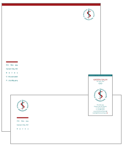 SHC works with healthcare providers to ensure their billing practices comply with current coding practices and yield
the maximum revenue.
SHC works with healthcare providers to ensure their billing practices comply with current coding practices and yield
the maximum revenue.
This logo combines a well recognized symbol for medicine, The Staff of Asclepius, with an even better recognized symbol, the dollar sign.
The stationary design combines the logo with a colored bar that uses either color in the logo to set off the address
or provide an area on the business card to reinforce the basic process: "Revenue = documentation
+ coding + billing".
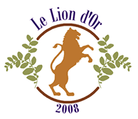
Estate Logo Concept 1
Client:
Private party
Goals:
Marketing: Identity branding
Accomplishments:
This logo and stationary were designed for an estate in Sonora County modeled after a French villa. The property has olive trees as well as vineyards. The client wanted to incorporate a specific lion from a villa in France as the mascot for the logo. The colors were selected from the color palette of the home's interior. There were several concepts that YBP provided and this is the design that was chosen.
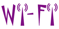
Wi-Fi Logo
Client:
A Fortune 500 Silicon Valley Corporation
Goals:
Marketing: Employee awareness of the company's addition of a wireless network and when their building would be impacted.
Change Management: Encourage employees to install the software on their computers that would let them take advantage of it.
Accomplishments:
This was a very successful Change Management campaign. This is a situation where the employees were looking forward to the change so all we needed to do is provide information. This logo was incorporated into promotional material posted in buildings and banners hung in cafeterias, as well as a Change Management Web site integrated into IT's Web site.
Logo Concept
Client:
A Fortune 500 Silicon Valley Corporation
Goals:
Marketing: Communication logo for a VP
Accomplishments:
Even though this was amusing to most employees because the V.P. was well known, and had an imposing personality, he thought it too arrogant to be included in the division's branding. This was done early in my career and I was still making adjustments to accommodate the cultural difference between Apple Computer (my last corporate experience) and a more "buttoned down" industry.
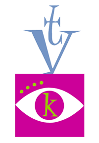
TV Logo Concept 1
Client:
A Fortune 500 Silicon Valley Corporation
Goals:
Marketing: Brand concept for internal television broadcasts
Accomplishments:
Three logos for an internal television channel coined "Knowledge TV". This concept was a take-off from the 50's graphic style.
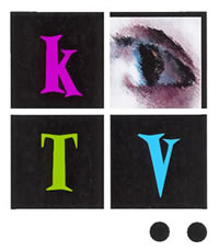
TV Logo Concept 2
Client:
A Fortune 500 Silicon Valley Corporation
Goals:
Marketing: Brand concept for internal television broadcasts
Accomplishments:
Another idea for the KTV logo emphasizing the call letters.
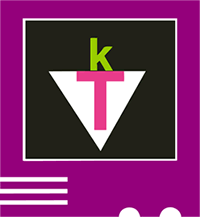
TV Logo Concept3
Client:
A Fortune 500 Silicon Valley Corporation
Goals:
Marketing: Brand concept for internal television broadcasts
Accomplishments:
A third concept with a more literal approach by making a graphic icon of a television.
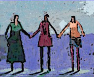
Non Profit Logo
Client:
Silicon Valley Webgrrls
Goals:
Marketing: Identity branding
Accomplishments:
The Silicon Valley Webgrrls was part of an international organization of over 20,000 women whose profession is connected to the Internet, www, or multimedia. Ms. Lewis headed up the SVW Web site committee for 3 years and designed the logo for the chapter. The logo depicts three women holding hands to form a "W". It portrays the friendship and support of many women to forge ahead in a field primarily populated by men.
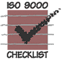
Company Logo
Client:
Quality Resource Center
Goals:
Marketing: Logo and Stationary for a company that specialized in ISO 9000 certification
Accomplishments:
This is the color version of QRC's logo. Another black and white version was created for print. YBP created stationary, and a new Web site for them.
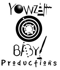
YBP Original Logo
Client:
Yowzah Baby Productions
Goals:
Marketing: Logo and Stationary for our company that combines our 3D solids modeling with our graphics capability
Accomplishments:
This is the first version of our logo meant for invoices and other print media that is generally one color. YBP created a two color version in purple and yellow for stationary and business cards. The bulls eye represents our core value of getting the job done right. The other elements tie together our capabilities in the different creative fields.
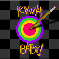
YBP Original Logo - Web site
Client:
Yowzah Baby Productions
Goals:
Marketing: Logo and Stationary for our company
Accomplishments:
Our old Web site created in 1996 had a full color version of our logo made up of solids modeling for the pencil, combined with a Fractal Painter treatment for the logo - now a quite common filter in Photoshop.
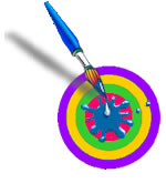
YBP New Logo
Client:
Yowzah Baby Productions
Goals:
Marketing: Update our logo for for our company
Accomplishments:
An update to our original logo, it still remains similar to the previous version, but is more compact. Gone are the days where there is a splash page for a site's entry.
